
A Heuristic Evaluation


A heuristic evaluation of Zara’s e-commerce platform, employing the simple task flow of purchasing a shirt.
Role: UX / UI Designer
Project Partner: Kevin Furtado
Tasks Completed: Heuristic audit; Research; Redesign of icons, screens and calls to action; Prioritized changes; Presentation design; Delivered presentation.
Project Goals & Highlights
Elevate the ZARA online shopping experience through a heuristic audit, with the primary focus on enhancing user satisfaction to reduce bounce rates, boost engagement, increase sales conversion rates and fundamentally improve revenue generation.
Highlights
Gained firsthand experience in the effectiveness of performing a heuristic evaluation on a website to pinpoint usability issues.
Experienced the value of prioritizing changes when making a pitch to stakeholders.
Discovered the paramount importance of aligning functional design with user habits.
Recognized the significance of upholding brand consistency when crafting solutions for a company.
Presentation Video
Heuristic Evaluation & Design Solutions
Section 1

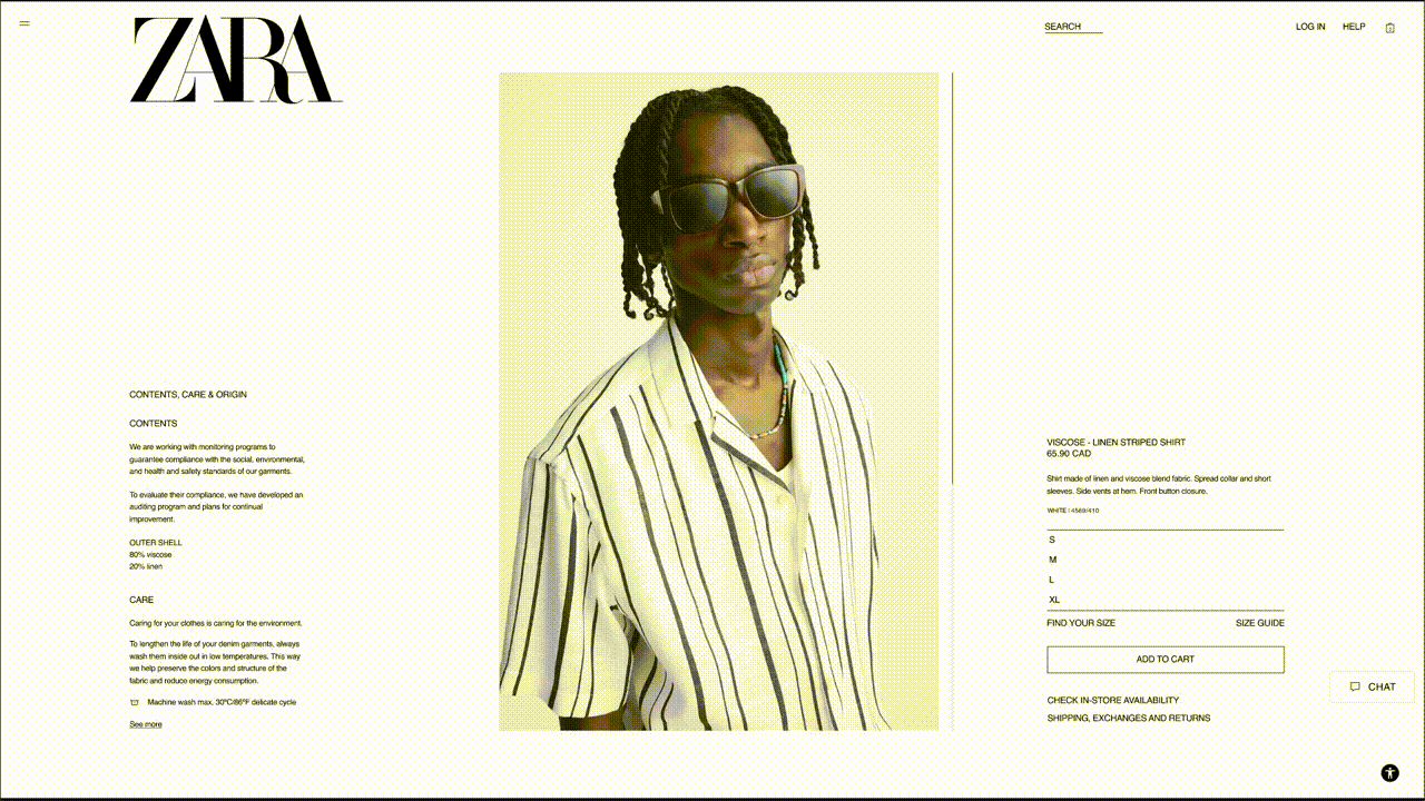
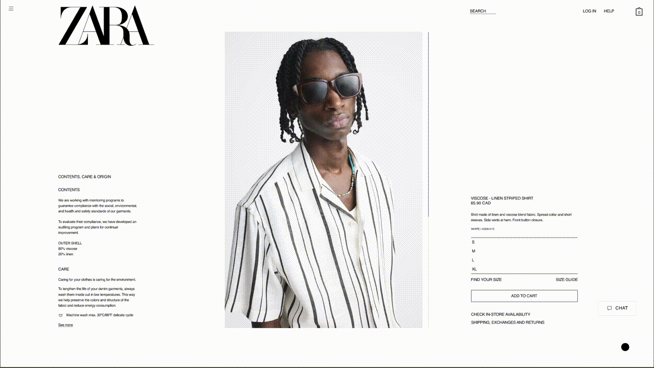
Heuristic Violation 1 : Error Prevention
Sizing options do not appear to be interactive CTA’s so the user’s attention is drawn to Add to Cart button prior to size selection. This initiates a warning message that can be avoided with a cosmetic redesign of the sizing buttons.

Heuristic Violation 2 : Recognition Rather Than Recall
Sizing options do not appear to be interactive CTA’s so the user’s attention is drawn to Add to Cart button prior to size selection. This initiates a warning message that can be avoided with a cosmetic redesign of the sizing buttons.

Redesign : The style and size of the buttons have been redesigned to target the attention of users with added feedback to ensure the user knows to proceed to “Add to Cart” after they have selected their size. The redesign maintained consistency with the rest of ZARA’s UI design style.

Redesign in Action
Section 2
Heuristic Violation 3 : Freedom and Control
ZARA’s original design does not easily allow for users to reverse the action of adding an item to their shopping bag.
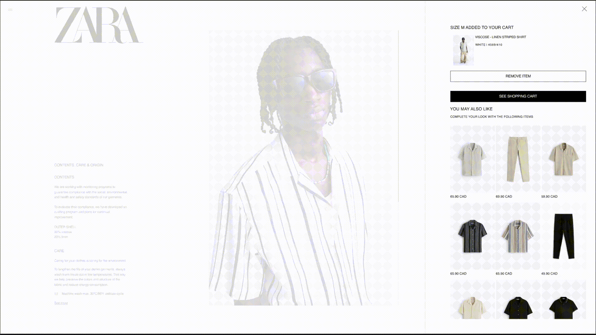
Redesign in action : We added a “Remove Item” button above the “See Shopping Bag” button in the pop out modal to help users quickly reverse their action. We also added feedback to confirm that the item has been removed from the user’s cart. This button remained consistent with the rest of the site’s UI design.
Section 3
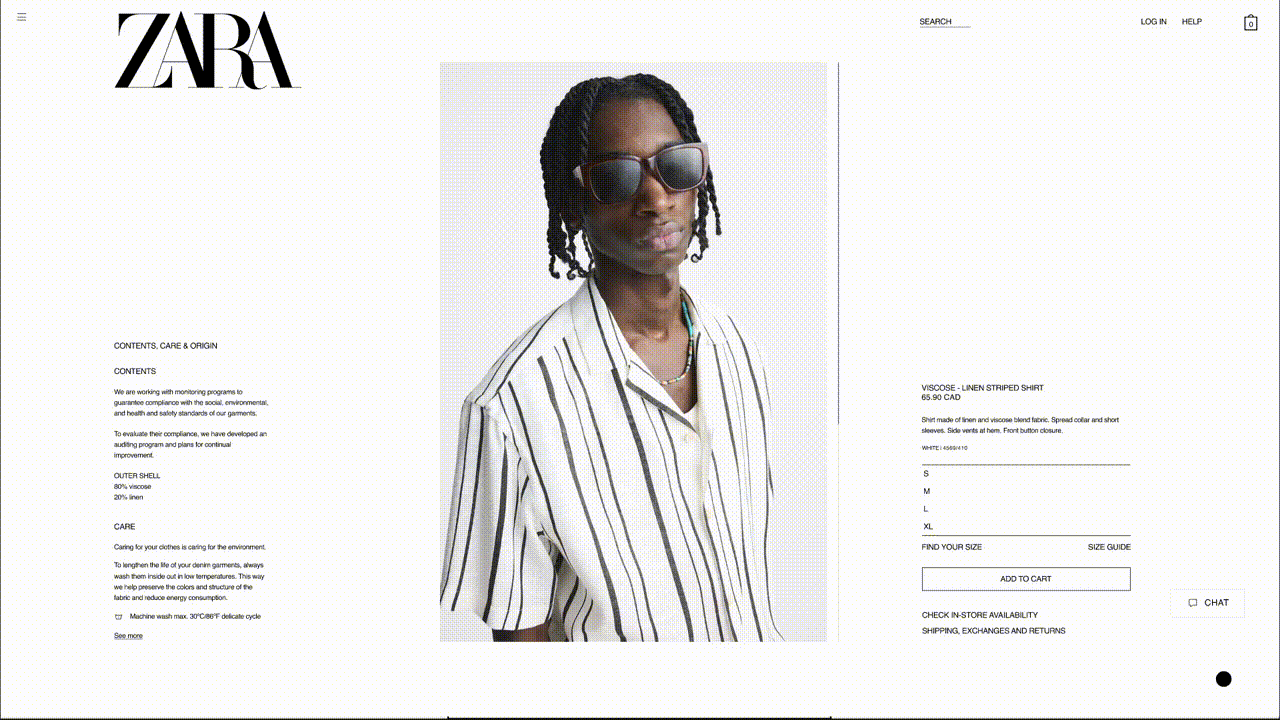
Heuristic Violation 4 : Visibility of System Status
This molecular design of the shopping bag icon does not pass accessibility standards and makes it difficult for users to navigate to their shopping bag.

Redesign : To make the shopping bag icon more visible, we enlarged it to improve its visibility, added dimension to it to make it stand out, and included an animation once an item has been added to the shopping bag to draw the user’s attention to the icon to improve visibility.
Redesign in action
Section 4
Heuristic Violation 5 : Help and Documentation
Once the user has deleted an item from their shopping bag, they are left on an empty shopping bag screen without any navigation buttons, aside from the ZARA logo as a means to return to the home screen.

Redesign
The redesign of the shopping bag included several items. First, we added a “Continue Shopping” button to the middle of the left side of the screen as a more obvious return to shopping action. We also added a hamburger menu to the top left corner of the screen, remaining consistent with every other screen along the way to allow a more intentional ‘return to shopping’ action. And lastly, we added a section to the right side of the page called “You May Like” allowing for a very intentional ‘return to shopping’ action based on similar items they have previously viewed or added to their cart.